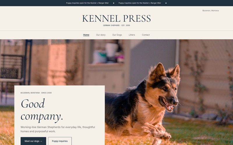
A dog breeder website template should not be chosen from a thumbnail alone. The real test is what happens after you add twelve years of dog photos, a planned litter, five-generation pedigrees, health results and the questions a careful puppy buyer asks before sending a message.
That is where otherwise attractive templates fail. A dramatic home page may need a professional hero photo you do not have. A tidy three-card layout may become awkward when your program has eight active dogs. A beautiful desktop menu may hide the litter page on a phone. The layout has to fit the way your breeding program actually works, not the imaginary version with perfect photos and one uncomplicated litter.
Who this is for: dog breeders choosing a first website layout or replacing a template that makes current dogs, litter plans and health information harder to find than they should be.
I built Kennel Press, so the examples below are ours. They are not design mockups. Each image is captured from a fictional demo program running the same template, dog profiles, litter pages, pedigrees and inquiry path a breeder gets. You can open the template gallery, scroll inside every live demo, switch between desktop and mobile, and test the dog and litter pages yourself.
The quick answer: match the layout to your hardest content
The best dog breeder website template is the one that handles the least polished part of your real content without making the strongest part disappear.
| If your program has… | Start with… | Why it fits |
|---|---|---|
| Strong, consistent photography | Showcase or Sculpture | Large image areas turn a good portrait into the first impression |
| Casual phone photos from everyday life | Field Notes, Clearview or Happy Pack | Framing and typography carry more of the design, so one photo does not have to do all the work |
| Several active dogs and deep records | The Companion Index | Directory-like navigation makes individual profiles easier to scan and revisit |
| A leading sire, dam or established bloodline | Legacy | The animal and pedigree read as the center of the program |
| A family-raised story and planned litters | Homestead | The editorial rhythm gives story, dogs and litter plans room without rushing the visitor |
| First-time puppy families | Happy Pack or Clearview | Friendly or plain-spoken layouts make the next step easy to see |
Do not read that table as a rule. Every Kennel Press template draws the same underlying dogs, litters, health results, pedigrees and inquiry form. You can switch templates later without entering the content again. The differences are emphasis: what the buyer notices first, how much the photography is asked to carry, and how quickly a visitor understands where to go next.
What a good breeder template has to do
Before comparing colors or fonts, give the layout seven jobs.
- Make ordinary photography feel intentional. Most breeders have a mix of show photos, phone portraits, puppy snapshots and older images they cannot retake. A useful template gives that mix a rhythm instead of assuming every image came from the same studio.
- Give every dog a real profile. A card is only the doorway. A buyer should reach the registered name, titles, health results, pedigree and related litter information without hunting.
- Separate current availability from future plans. A born litter, an expected litter and a pairing planned for next year do not mean the same thing. The layout should make status clear before a buyer inquires.
- Show evidence, not just claims. Health tests belong by name and result. Pedigrees need registered names and room to read. “Health tested” and a pedigree screenshot are not substitutes for structured information.
- Keep navigation usable on a phone. A family may arrive from a social post with one thumb and one question: “Is there a litter?” The answer cannot be three menus deep.
- Put the next step beside the decision. A visitor who has just read a dog or litter page should not have to return home to find the inquiry form.
- Stay current without a redesign. A template is not successful if adding the next dog or changing a litter status breaks the composition.
With those jobs in mind, here is what each layout is actually good at.
Showcase: when the photography is the proof
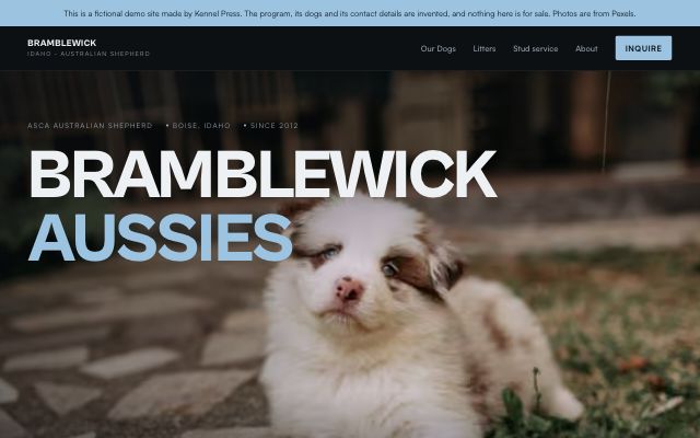
Showcase is dark, bold and image-forward. The large type and high-contrast canvas make a strong dog portrait feel important before the visitor reads a word. That suits a program with consistent show, sport or outdoor photography and a visual identity it already knows.
The tradeoff is honesty. A large frame also makes weak cropping, screenshots and dim indoor photos more obvious. If your library is inconsistent, choose one dependable image for the opening and let dog cards carry the rest. Do not fill every available image position simply because it exists.
For a buyer, Showcase creates a fast sense of confidence when the visual record is already strong. The dog profile still has the health and pedigree detail underneath; the home page simply leads with the animal. Open the live Bramblewick demo and move from the home page to a dog profile before judging it.
Best fit: programs with a recognizable leading dog, a reliable photographer or a consistent show and sport archive.
Homestead: when the program story matters as much as the dogs
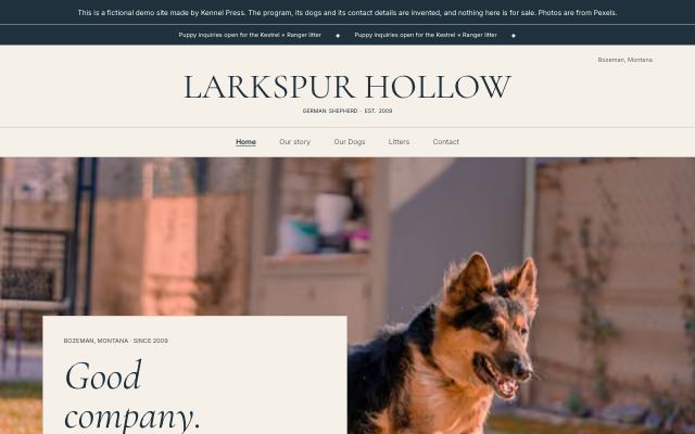
Homestead uses warm paper, editorial type and a slower page rhythm. It is comfortable with a dog in the yard, a breeder at home and a litter update that feels like part of an ongoing story. Photography matters, but it does not have to look like a campaign.
This is a strong choice when buyers need to understand how puppies are raised and why pairings are made. The layout can introduce the family and philosophy, move into featured dogs and a current or planned litter, then answer process and pricing questions before the inquiry form.
That sequence matters to a buyer who is not choosing on looks alone. It gives them context before availability and a clear next step after it. The pedigree presentation also feels at home in the editorial design rather than bolted onto a generic portfolio page.
Best fit: family-run or long-established programs with a meaningful story, planned litters and a mix of polished and everyday photos. See it on the live Larkspur Hollow demo.
Legacy: when one bloodline leads the conversation
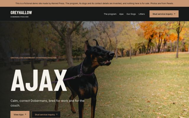
Legacy is direct, dark and animal-first. Condensed display type and a restrained accent give it the feel of a program built around a working record, a leading sire or dam, or a bloodline with history.
The layout works when a visitor is likely to enter through one dog and then inspect the dogs behind it. Titles, record lines and pedigree relationships feel central. That makes Legacy useful for stud-forward programs and for breeders whose buyers already know the names they are researching.
It asks for fewer decorative words than Homestead. The buyer impact comes from clarity: this is the dog, this is the record, this is the lineage, and this is how to ask about the program. If your strongest material is the documented animal rather than lifestyle photography, that directness is an advantage.
Best fit: stud-forward, performance or established-line programs with pedigrees and titles buyers actively inspect. Follow a dog into its profile on the live Greyhallow demo.
Field Notes: when the photos come from real life
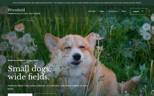
Field Notes is the most forgiving of a useful kind of imperfection: dogs photographed where they actually live. Warm paper, numbered sections and a naturalist’s type style create consistency around photos that may come from different days, seasons and phones.
That does not mean blurry or careless images suddenly become good. It means the design does not require every photo to share a backdrop. A puppy in the kitchen, an adult in a field and an older win photo can belong to the same program because the page supplies the visual system.
For puppy buyers, that can make the site feel observed rather than staged. The health section and litter status still interrupt the story with concrete facts, which keeps “home raised” from being the only message.
Best fit: small and family-raised programs with honest everyday photography and breeders who prefer a quieter voice. Try both the home page and dog page on the live Wrenfield demo.
Sculpture: when every dog deserves a portrait
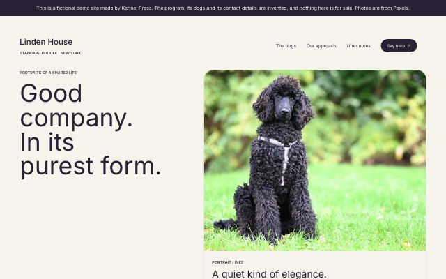
Sculpture is modern, airy and portrait-led. Rounded frames and soft color fields separate each dog without making the whole site feel like a grid of inventory. It works especially well for a small program where visitors are expected to meet every animal.
Compared with Showcase, it asks for light and clean portraits rather than dramatic ones. One strong image per dog is more useful here than a large gallery of near-duplicates. The surrounding space also makes short, specific copy look better than a dense biography.
The layout helps a buyer keep individuals distinct, then move into health results and pedigree on the profile. For programs with only a few active dogs, that personal focus can be more useful than a directory designed for volume.
Best fit: small programs with good individual portraits, concise dog biographies and a modern brand. Open the live Linden House demo.
The Companion Index: when buyers need to compare several dogs
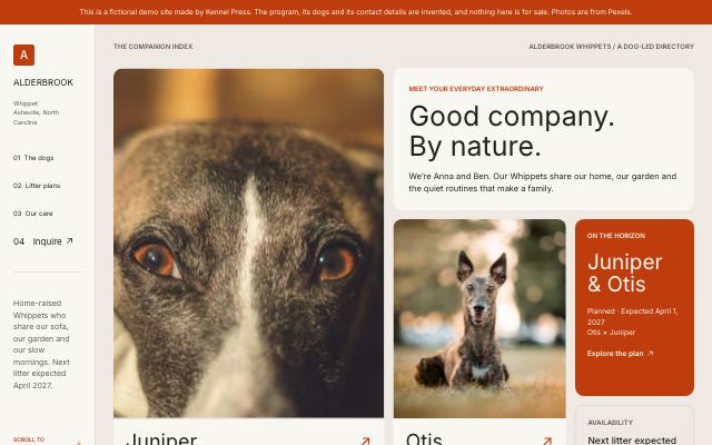
The Companion Index treats the website like an organized directory. A navigation rail and a mosaic of tiles help visitors move among dogs, litter plans and care information without repeatedly backing out to the home page.
This is the layout to test when your current site has become a long scroll of adult dogs. The visual system can absorb more profiles because it is built around finding and comparing, not presenting one hero image at a time. It also puts less pressure on every dog photo to have the same shape or setting.
For buyers, the benefit is orientation. They can remember where they are, compare profiles and return to the litter or inquiry path. That is particularly helpful when the program has several active dogs, retired dogs kept for reference, or multiple planned pairings.
Best fit: larger programs and breeders with enough structured information that navigation is part of the design problem. Explore the live Alderbrook demo.
Happy Pack: when the first impression should feel approachable
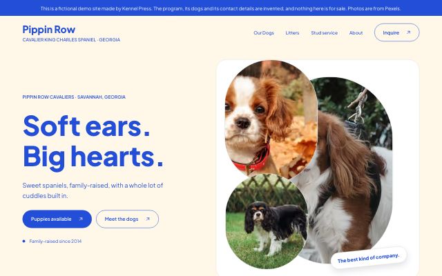
Happy Pack uses rounded type, bold color and oval or circular crops to create a friendly family-pet tone. The shaped frames can make a varied photo library feel more related because each image enters the same visual language.
The danger with a playful template is letting warmth replace information. Happy Pack still needs specific health results, honest litter status and a real pedigree behind the friendly surface. Used well, it lets those serious details feel understandable to a first-time puppy family rather than clinical.
Buttons and inquiry paths are visually obvious, which helps on a phone. A visitor can meet the dogs, see what is planned and understand where to ask a question without decoding the site first.
Best fit: companion-focused programs speaking to families, especially when warmth and a simple inquiry path matter. Switch the live Pippin Row demo between desktop and phone in the gallery.
Clearview: when clarity should do the selling
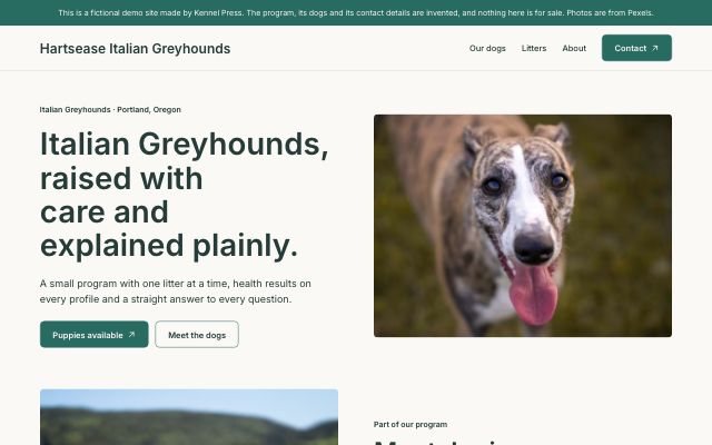
Clearview is calm, minimal and plain-spoken. It does not ask the breeder to perform a brand. It gives availability, care, dog profiles and contact information an even structure and keeps the reading path obvious.
That makes it a useful answer to inconsistent photography. One muted palette and steady spacing can unify a mix of professional and phone images without pretending they are the same. It is also a good test for whether your words are doing their job: unclear litter status has nowhere to hide in a deliberately clear layout.
For a buyer, Clearview reduces uncertainty. Where are the dogs? What is planned? What health work is shown? How do I inquire? A template cannot supply those answers, but it can keep them from being buried.
Best fit: small, home-based programs that value direct information over spectacle. Walk the full path on the live Hartsease demo.
Test the dog profile, not just the home page
The home page is the easiest screen to make attractive. Before choosing a dog breeder website template, open one complete dog profile and check the material a serious buyer will use.
Animal profiles
The dog’s call name should orient the page, but the registered name, titles, color, status and biography need a readable hierarchy. Photos should support the record instead of pushing it below several screens of gallery. On a phone, check that the inquiry action still makes sense after the profile rather than only at the top of the site.
Health-testing information
Look for named tests and results attached to the dog they describe. A buyer comparing two potential parents should not have to remember which result belonged to which animal. External result links should read as supporting evidence, not as the only information on the page. If you are deciding what to publish, the health-testing guide covers what buyers expect to see.
Pedigrees
A pedigree has to work at phone width without becoming a microscopic screenshot or a sideways spreadsheet. Start with the generations a visitor can understand, then let deeper generations open when they need them. Registered names and record lines should remain text a buyer can read and search.
Legacy and Homestead give pedigree material a traditional editorial setting. The Companion Index keeps it inside a more navigational experience. The underlying ancestry is the same; choose the presentation that fits how much of your audience arrives already looking for bloodlines.
Test current and planned litters as two different buyer questions
A current litter answers “what is available now?” A planned litter answers “what should I follow, and when should I come back?” A useful layout does not blur the two.
On a born litter page, look for the parents, birth date, puppy status and a direct inquiry path. On a planned or expected litter, look for the proposed pairing, timing stated with appropriate uncertainty, and an honest next step. The template should not make a plan look like a promise.
Then return to the home page. Can a buyer tell which situation exists without opening every card? If your program often has no current litter, pay attention to how the layout handles that quiet period. A clear “nothing available now” with the next plan is more trustworthy than an old litter left in place to keep the page full.
Test mobile navigation with one thumb
Open the live template gallery, choose a layout and press Mobile. Do not just admire the narrow preview. Give yourself three tasks:
- Find a dog and reach its pedigree.
- Find the current or next litter and understand its status.
- Start an inquiry from the page that created the question.
The menu should use ordinary words, the tap targets should be comfortable, and the inquiry route should not disappear when the desktop header collapses. Also watch the photos. A wide group image that works on a laptop may crop the important dog out on a phone; a good template gives you a focal point, but the source photo still needs room around the subject.
Test the contact path from the buyer’s decision point
“Contact” in the main menu is necessary and not sufficient. The buyer should also find a relevant inquiry action after a dog profile, a litter page and the home-page section that explains availability.
That placement changes the quality of the conversation. The visitor has context, and the breeder knows which dog or litter prompted the message. The form should ask enough to start a useful exchange without turning the first hello into a twenty-minute application.
When you preview a template, follow the path all the way to the form. If the transition feels abrupt, check whether the page needs a short process section before the action. Layout and copy work together here; no button label can repair a process the site never explains.
What about free dog breeder website templates?
A free dog breeder website template is useful if it lets you test the real structure before paying: dog profiles, litter status, health results, pedigrees, phone navigation and an inquiry form. A free theme that only gives you a home-page mockup does not answer the hard questions.
Kennel Press has a Free plan with 4 templates. The breeder pages and technical search foundation are included; paid plans open every template and additional limits. Because the content is separate from the design, you can begin on a free template and switch later rather than rebuilding each dog and litter.
If you use a free template on a general website builder, run the same test. Work out how one dog becomes a structured profile, how a status change reaches every place it appears, how a pedigree behaves on a phone and how the inquiry identifies the animal. “Free” can be a good starting price and an expensive structure to maintain by hand.
Frequently asked questions
What is the best dog breeder website template?
There is no single best layout for every program. Showcase and Sculpture suit strong portraits; Field Notes, Clearview and Happy Pack are more forgiving of varied everyday photography; The Companion Index suits several dogs; Legacy centers bloodlines; and Homestead gives the program story and litter plans more room. Choose against your real content, not a sample kennel with different strengths.
What pages should a dog breeder website template include?
At minimum: a home page, individual dog profiles, current and planned litter pages, an about or program story, health-testing information, contact and privacy information. Dog profiles should hold pedigrees and individual health results rather than sending buyers to disconnected pages or image files.
Can casual phone photos work in a professional template?
Yes, if they are clear, well lit and honestly framed. Field Notes, Clearview and Happy Pack use typography, spacing and repeated shapes to give varied images more consistency. Pick one strong opening photo, avoid filling every slot, and crop around the dog rather than around the template.
Are there free dog breeder website templates?
Yes. Some general builders provide free themes, and Kennel Press’s Free plan includes 4 templates. Compare what the free option does with dog profiles, litters, health results, pedigrees, mobile navigation and inquiries, not only how its sample home page looks.
Can I change templates after my website is live?
On Kennel Press, yes. The dogs, litters, photos and words are stored separately from the template, so switching the look does not require re-entering the program. On another platform, confirm this before you choose; some themes store content in page layouts that are difficult to carry into a new design.
Choose with your real program open beside you
Make a short inventory before you browse: your strongest five photos, the dogs that need profiles, the current and next litter, the health results you publish, the deepest pedigree a buyer needs and the inquiry step you want them to take. Then test that exact material against the layouts above.
The right template will not make the program more established, the health testing more complete or the litter status more current. It will make those real things easier for a buyer to see and understand.
Compare every Kennel Press dog breeder website template in the live gallery. Open the dog and litter tabs, switch to Mobile, and use the full demo before you decide.